Mastering Box Plots in Excel: A Simple Guide
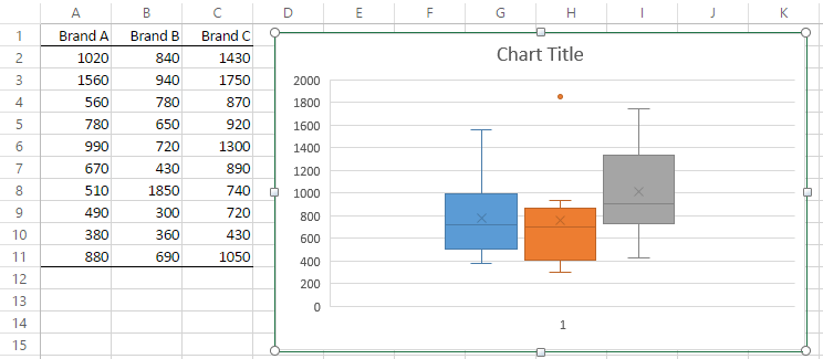
Box plots, also known as box-and-whisker plots, are powerful visual tools for displaying data distribution. They offer a quick and effective way to understand the central tendency, variability, and skewness of your dataset, making them invaluable in fields ranging from statistics to business analytics. This comprehensive guide will lead you through the process of creating and interpreting box plots in Microsoft Excel, ensuring you can harness this statistical visualization technique for your data analysis needs.
What are Box Plots?
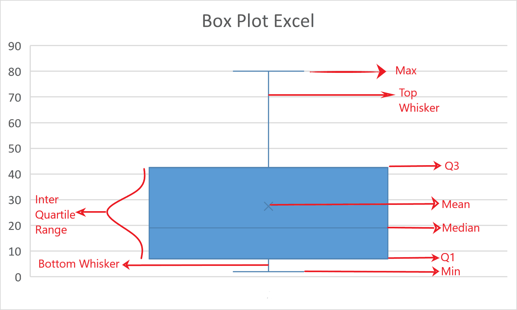

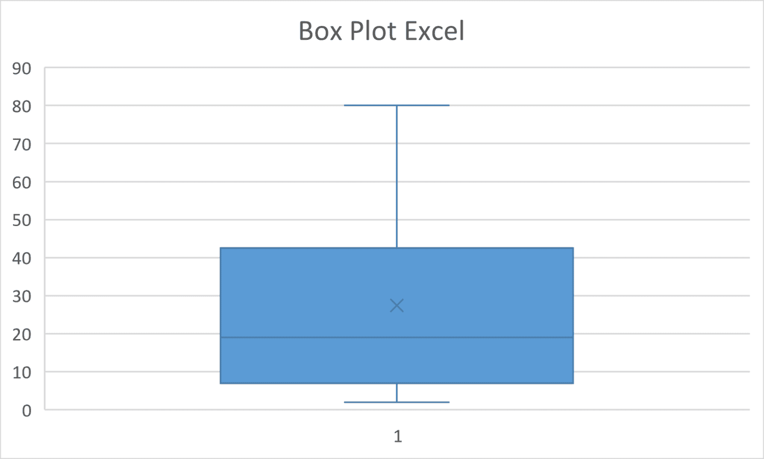
A box plot is a graphical depiction of groups of numerical data through their quartiles. Here’s what each part of the box plot represents:
- Minimum: The smallest non-outlier value in the data set.
- First Quartile (Q1): Also known as the lower quartile, it’s the median of the lower half of the data.
- Median (Q2): The middle value of the dataset.
- Third Quartile (Q3): The median of the upper half of the dataset.
- Maximum: The largest non-outlier value in the data set.
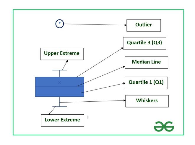
- Whiskers: Lines extending from the box to the minimum and maximum values, excluding outliers.
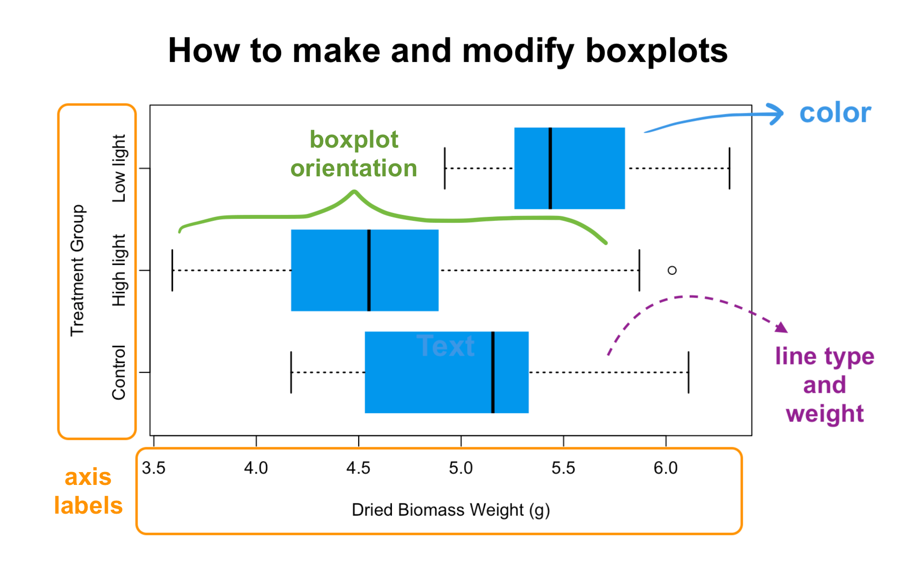
- Outliers: Points that fall outside the range defined by 1.5 times the interquartile range (IQR) above the third quartile or below the first quartile.
Creating Box Plots in Excel

Excel makes creating box plots straightforward. Here's how you can set them up:
Step-by-Step Guide
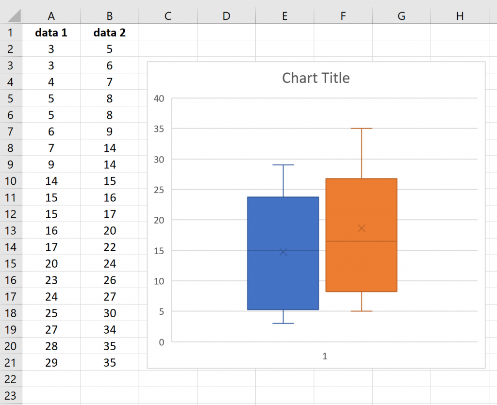
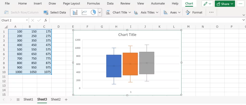
- Prepare Your Data: Ensure your data is in a continuous range of cells. Label your columns if necessary.
- Select Your Data: Click and drag to select the entire data range you want to include in your box plot.
- Insert a Box Plot:
- Go to the “Insert” tab.
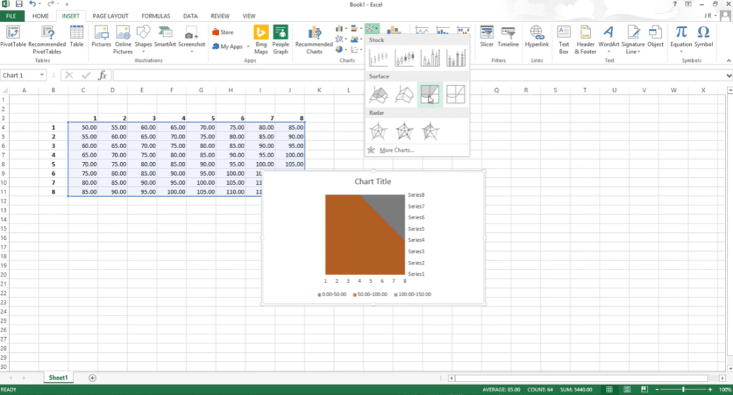
- Select “Insert Statistic Chart” (Excel 2016 onwards).
- Click on “Box and Whisker” for a simple box plot or explore other options for different styles.
- Customize Your Plot:
- Right-click on any element to format it. This includes changing colors, adjusting the style, or modifying axis labels.
- Use the “Chart Tools” that appear at the top when you select your chart for further customization options.
Interpreting Box Plots
| Feature | Interpretation |
|---|---|
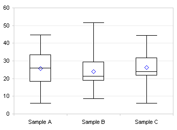
| Median Line | Indicates the central value of your data. A high median suggests higher values are more common. |
| Box Length | Shows the interquartile range (IQR). A longer box indicates a larger spread of values. |
| Whiskers | Reveal the range of the bulk of the data. Shorter whiskers mean less variability. |
| Outliers | Possible errors or exceptional cases. They should be investigated for data integrity. |
Example

Consider you are analyzing employee satisfaction scores:
- A longer box might indicate significant differences in how employees perceive their work environment.
- A median line close to the third quartile suggests higher overall satisfaction.
- Whiskers extending to the lower range might reveal a subset of employees feeling significantly dissatisfied.
📌 Note: When interpreting box plots, consider the context of your data. For instance, a large IQR might not always indicate a problem if the variation is expected.
Advanced Box Plot Customizations

Excel offers several ways to make your box plots more informative or visually appealing:
- Colored Boxes: Different colors can represent different categories or emphasize different parts of your data.
- Multiple Series: Compare different groups by creating separate box plots within the same chart.
- Axis Adjustments: Fine-tune the scale or labels for clearer comparisons.
- Overlay Other Charts: Combine box plots with scatter plots or histograms for a richer visualization.
Limitations and Considerations

While box plots are powerful, they do come with some caveats:
- Box plots show summary statistics, which might miss finer details of the distribution.
- Overlapping data points can lead to ambiguous representations.
- They can sometimes hide the presence of sub-populations or multimodal data distributions.
⚠️ Note: Box plots should be part of a wider data exploration strategy rather than a standalone analysis tool.
This journey through box plots in Excel should equip you with the skills to visualize and interpret data distributions more effectively. Whether you're a student, researcher, or professional, the ability to create and analyze box plots can enhance your data analysis toolkit, providing clarity and insights into your datasets. Remember, like any tool, box plots are most powerful when used appropriately within the context of your data and alongside other statistical and graphical methods. Keep exploring, keep learning, and let your data guide you towards meaningful insights.
Why should I use box plots in Excel instead of other charts?
+
Box plots are particularly useful for showing the distribution of data at a glance, highlighting outliers, and comparing multiple datasets without assuming any underlying distribution, making them versatile for many types of data analysis.
Can I create side-by-side box plots to compare different groups?
+
Yes, you can. By selecting data from different groups and using the “Box and Whisker” chart type, Excel will automatically create side-by-side plots for comparison.
What do I do if my data includes outliers?
+
Outliers can be either errors or significant data points. In Excel, you can adjust the whiskers to include or exclude outliers or investigate these outliers for potential data entry mistakes or unique phenomena in your dataset.
